Hi Nitromians,
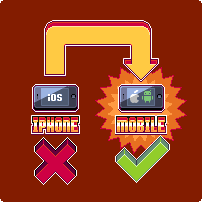
Today we have made a couple of tweaks to the mobile visualisation on our site. More specifically the 'iPhone' tab now reads 'Mobile' with the phone screen adjusted to contain an Android and Apple logo.
We have also updated the 'iTrome' category in the blog to instead read 'Mobile'. Both of these have been adjusted to reflect the fact that, with the upcoming launch of Icebreaker to Android, we are focused on both the major mobile platforms.
With future mobile games we plan to launch to both iOS and Android at the same time so it made sense to make this change.
